Pages

Friday, 2 May 2014

Documented Life Project - Let's get started!!

Well here we are at the long 1st May weekend here in France and I've been preparing to actually start this project this weekend! What is it??? You’ll find all the details here: 

But basically it’s “One part planner plus one part art journal and one part weekly challenge”. Take a diary and add journal pages or make your planner from scratch. Every week there’s a challenge, for example this week is, April 26, 2014 - Week 18 Challenge - Add an inspiring quote to guide your week. I saw this project on Facebook or Darcy mentioned it, can’t remember! Anyway we, and many other people, are doing it, and it’s not too late to start. I used a Moleskine Large 2014 Planner.

In preparation for this long weekend. I gessoed the covers taking care to mask the elastic and covering the pages with silicon paper to keep them clean.
Covers gessoed ready to start decorating
For the tabs I cut 1½ inch strips of cardstock and folded them in half to give me ¾inch high tabs which I cut in to approx. 2¼ inch long pieces.
1½ inch strips of cardstock, folded in half  = ¾inch high tab

I trimmed the ends using  my my Tab punch from Stampin Up (I managed to get this fab punch on ebay in the states before it got a ridiculous price). The other punch that is good for this is the McGill punch but it too is no longer available. You could use the envelope board punch but you’d have to do arithmetic to position the curve!!
The Stampin up Tab punch
trimming the ends to make the tab curves
The final tabs are approx. 2inches long.
tabs cut
Next I dug out all those Making Memories Magnetic Stamp Tins. I bought loads of these cheap on ebay and finally I get to use them, they're a fun alternative to printing on the computer and remind me of John Bull printing sets when I was a kid.
Set with dates, months and some holidays
the magnetic stamp handle
a couple of alphabets
unnamed alphabet
working backwards
testing on plain paper, I finally chose the bottom one
I decided that the police size in the date set was too small so I then tested all my alphabets and settled on one (which has no name!).  I stamped all the months of the year on the back and front of the tabs, I stamped them on plain paper first to test, thankfully because you have to remember you’re working backwards and it’s very easy to spell Fedruary and not February!!! 
All the tabs were distressed with Frayed Burlap using a dauber. 
stamped and distressed
love the fact that they're not perfectly aligned!

I haven’t decided if I’m going to use clear sticky vinyl or gell medium to stiffen them and make them resistant. 
a Seawhite notebook cut to size for the pages
Next I took an A4 Seawhite watercolour journal and cut it up, yes even the black covers, to make my journal which are 4⅞ x 8⅛ inches. I managed to get 46 I believe, which gives me enough to get going.

Hopefully this weekend I'll get time and peace to get the covers finished so I can then get the pages started. Here is a glimpse of colours and ideas going around in my head. I really like the Journal page Darcy did for PaperArtsy using the Ellen Vargo Stamps
Think I'm going to base the design on what Darcy did with the Ellen Vargo Stamps


I have less space than in the journal that Darcy used so I'm going to have to reduce the sizes. Perhaps I'll draw the Greek keys by hand, perhaps I'll use another border....
Stamping on book pages and using Promarkers


Tuesday, 3 September 2013

Once upon a time...#3UP

To celebrate their 10th birthday PaperArtsy organised, amongst other things, another round of #3up! Just like the last time I jumped in not realising what I was in for!

This time the rules were a little different, as were the supplies. Stamps were added (use at least one), a shade card with 3 to 5 colours (again, use at least one), some substrates (use it, add it to something else, cut it..) and some embellishments.

Here's what came in my #3up package...
Stamp sets crowns and Castles SICC6 and SICC8
TAGS, TAGS, TAGS, 2  die cut from corrugated card,
two from white card, two Manilla Tags
3 sheets of beautiful Smoothy Heavy Weight white stamping card
and ribbons!


My first reaction was "OMG all that Pink and ribbons!" Whilst I was wondering what to do with all this, (perhaps a book, perhaps a series of tags mounted on a larger surface...) my Mystery box that I had ordered from PA arrived and I had more stamp sets which seemed to tie into a theme telling me something ...

"castles /shields / kings & queens / fairytale ".
Bricks & Mortar SIBM4
Ding & Dong SID1
I decided to make an accordion book, "Once upon a time.... in a land far away (could this be New Zealand?) the fairy tale of two young souls who lived in/came from a far away land. The book would feature our own Mr "King and" Mrs "Queen" PaperArtsy, and celebrate the 10th birthday of our fav stamping company.

   
Once upon a time .....

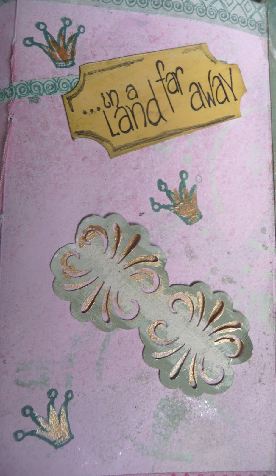
.... in a land.....
So here's the "Fairy Tale" book..
Front cover
The cover tags are  corrugated cardboard, panted with Sherbet, Rose, Very Berry & Claret Fresco paints and stencilled using Grunge Paste tinted with Honey Dew, Sage and Toad Hall Fresco paint.

Grunge paste tinted with Fresco paint

Fleur de lys
The fleur de lys was stamped in archival directly onto Fresco paint, then coloured.
 The "belly band" is a piece of grunge paper cut to size and covered with home-made "Washi tape". Micropore, Fresco paints stamped with Library green Archival. The edges were finished with Emerald, Ruby and Renaissance Treasure Gold.

Home-made Washi tape
 I made several different colours of tape, using Fresco paints and Crimson/Library Green Archival

inside of covers
I used the white card tags to line the covers and hide the joints of the pages to the covers. The treatment was more or less identical to the outside only changing the colours around. I also made angled pockets coordinating with the tags.

Sherbet tag

Sage tag
The tags were custom cut to size from the Manilla Tags crackled with the amazing Crackle Glaze. The Crowns were stamped on Manilla Tags using the Library Green/Crimson Archival, cut out, and once stuck down, jewels added. Not having a ribbon that matched the colour scheme of the sage coloured tag, I dyed plain white ribbon using Sage Fresco paint diluted with water. For the reverse sides of the tags see below..

Unfolded showing front side, spaces for two tags

The pages are from several sheets of cartridge paper. They were sprayed with water then I brushed a quick layer of Sherbet Fresco on Before spritzing with more Fresco paint diluted with water in Mini Misters. I also used stencils to give the pages a bit of back ground in a contrasting colour. The colours are reversed on both sides. I used the "washi tape" to edge the pages of the accordion book and also stuck random pieces to the pages. I cut smaller pages from the paper and sewed them into the folds with contrasting cotton.
The back cover was treated the same as the front with the exception of the shield. The shield itself was treated in the same green tones but crackled with  Crackle Glaze.
Back cover


The chalice which was first stamped on PaperArtsy's georgeous Smoothy Heavy Weight - white stamping card then painted with Vanilla, Haystack, Pumkin Soup, Claret, Sherbet and Hyde Park.

Chalice


I mounted the shield on a hinge so that when lifted it revealed another shield.  We're all raising our chalices (glasses of G&T) this month to celebrate....
Happy 10th Birthday PA!!
.....PaperArtsy's 10th birthday. I copied the image from the blog, resized it, printed it and painted over it with  Pumkin Soup and Little Black Dress. (wasn't sure I could transfer ink jet with medium but Darcy now tells me it can be done so going to attempt it later!).

Flip over the tags and you'll find photos of Mr & Mrs PA! The King & Queen, not of America,  but of Creaseys Farm, Essex, and of course UK stamping!

King and Queen

Happy Birthday 
to everyone at PA Castle HQ

... and thanks again for another opportunity to play!


Monday, 2 September 2013

Mini Album for Véronique

Album open
I needed to make a quick birthday present for a special friend. 
Véronique teaches French here in France, writes poetry and loves her beutiful garden. For her 60th birthday I thought it would be nice to make a mini album with tags so she could write her poetry on them.

Front cover

Back cover

Pages & tags
I decided on and Accordion burst type album. For the album I based the design on the Sunburst pattern from Laura Denison. 
After a false start and a big mistake with the two papers I had initially intended I delved in to my stash and pulled out some long forgotten goodies. I finally used Fancy Filigree and Divine Damask from Pink Paisley's  "Parisian Anthology" collection. Both of these papers have a resist watermark on them, which only really  shows up with inking. they are yummy....yes I don't do scrapbooking but love beautiful papers!


Inked & distressed papers
I distressed the papers with Tumbled glass, Milled Lavender, Spun Sugar and Victorian Velvet.
I then cut and assembled the pages.

I wanted to use my JOFY collection stamps from PaperArtsy on kraft card for the covers and the tags. I experimented with Versafine white, Momento Dessert Sand and Versamark Inks. All of these seemed like a great idea but in reality they were too light. Once dry the stamped images seemed to disappear into the cardstock and made it difficult to "colour in", worst even the translucent paints tended to obliterate the stamped lines. I decided to use a favourite, Archival Sepia. The texts were stamped Versamagic Purple Hydrangea. I made 7 tags, three vertical and 4 horizontal, some with text some without.


circles cut from the patterned paper to make tab pulls

 Fresco colours used: Pesto & Hyde Park for the grass, Moonlight, Lilac, Pansy, Claret, Smoked Paprika and Pumkin Soup for the flowers, buds and things.

Et Voilà!
Last word from Véronique: "I don't want to spoil the album by writing in it"!


Thursday, 1 August 2013

Saturday, 20 July 2013

The Bionic Bit

First off a huge thank you to all who are sending me best wishes. Having fun posting progress reports on twitter and FB. Me and the boy ( haven't named him yet!) have been together for 48 hours now and we seem to be getting along better. Still gives me a little pain now and again just to remind me he's there. 

My rythmologist ( that's how we call him in France ) has  just been in to control him and he's working well. We're looking at an eight year partnership, after that he'll have to be replaced for a younger model.  
You know how it is with us middle aged men!!

Hopefully I'll be back crafting shortly. Just  resting up for the moment.

Lunchtime so I'll sign off. 
A great weekend to all! Xxxx

Tuesday, 16 July 2013

Promarker Doodling


Over the last few days I’ve been doodling with my Promarkers,.I suppose it's my way off taking my mind off the days to come (they’ll come and go and I’ll deal with them!).

First off I wanted to make some colour charts so I could see:
  1. what I have in stock 
  2. how the colours look in reality 
  3. how the all work together

All colours


Oranges
Reds
Limited Edition Colours

I divided them up into Red, Orange, Yellow, Green, Blue, Purple and Pink. The greys have still to be done, but then again I've only got 4 coo grey Trias for the moment! I've combined the flexmarker and Promarker charts. At present I can get Tria markers for roughly the same price as a Promarker so where there is a Tria equivalent I buy the Tria marker.

I will to do some samples with suggested blending colours next week – more in a later post.

I have the Jofy 13 stamp just shouting at me to be used so, just like Jo Firth Young did in her sketchbook with Fresco paints, I fancied trying different colour ways with my markers.

Off I went, happy as Larry! 
 
Darcy suggested using Memento, Dessert sand for a subdued outline, black for a more pronounced one, she also defo said heavy white cardstock so the translucent colours are true and to avoid leeching and show through. Ok. So what did I do?

Yes, I stamped in my ordinary sketchbook. 


Funny how you can listen to advice and fail to carry it out! The result, as you can see, is as expected…..

The front
the colours leeching out with the outline... ..
not a bad watercolour look, though not what I was aiming for! 
 …….. like the colours though!

The back of the page!!
yep, almost all the colour came through the page..... 
 
the next page
.....and of course I didn't protect the following page so the colours stained that!
 

I’m off to prepare Chicken Tika then stamp on white SU 80lb cardstock…. Watch this space!

 Not much getting done these days but hopefully be back soon with makes